Innovative interiors from motoring history
With their high-tech infotainment systems, sat-navs and multiple driver aids, modern car dashboards are often a thing of wonder – but they don’t tend to offer much individuality.
That’s not always been the case, though. Look back a few years and you’ll find an extraordinary variety of different layouts and designs – from Art Deco-inspired steering columns to early digital efforts that looked like something from an Atari console.
Some were great and some were awful, but all did things a little differently. So join us as we take a trip through dashboard history…
1. Innocenti Mini
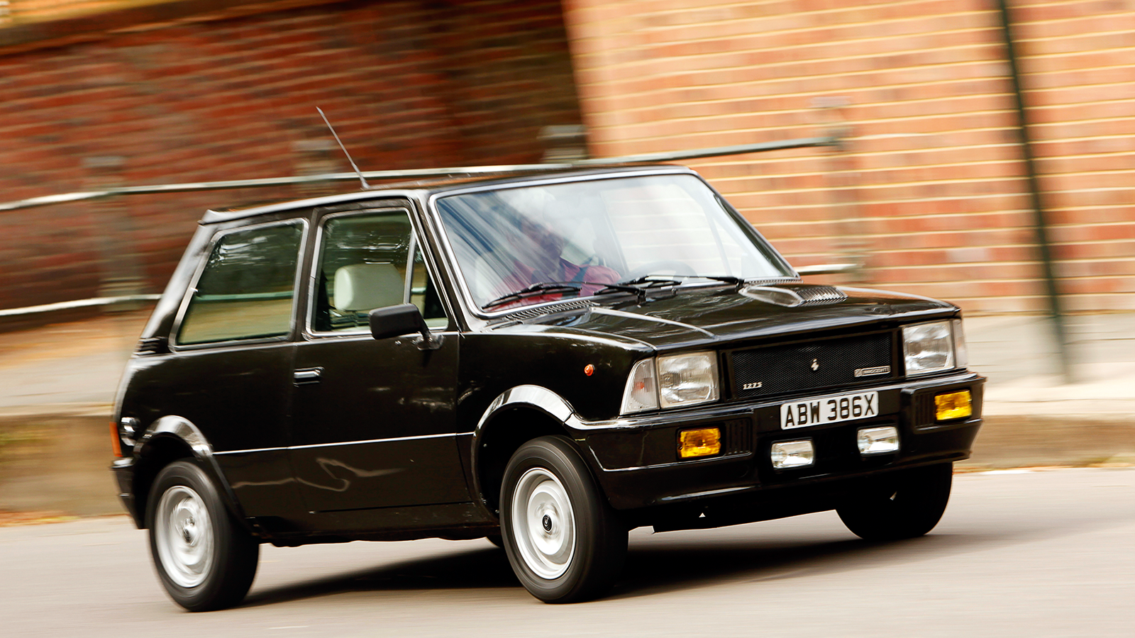
Italy’s Innocenti built everything from motor scooters to the unlovely Austin Allegro under license. It also churned out Alec Issigonis-designed Minis, giving many of them facia-width instrument clusters with pothole-shaped dials.
While British Leyland failed to replace the Mini, Innocenti commissioned styling house Bertone to come up with a pretty, cubist hatchback body in a car wearing 90 and 120 badges.
Innocenti Mini (continued)
The original’s A Series engine and bonsai-bus driving position remained, but the interior was a fine example of Italianate, ’70s good taste.
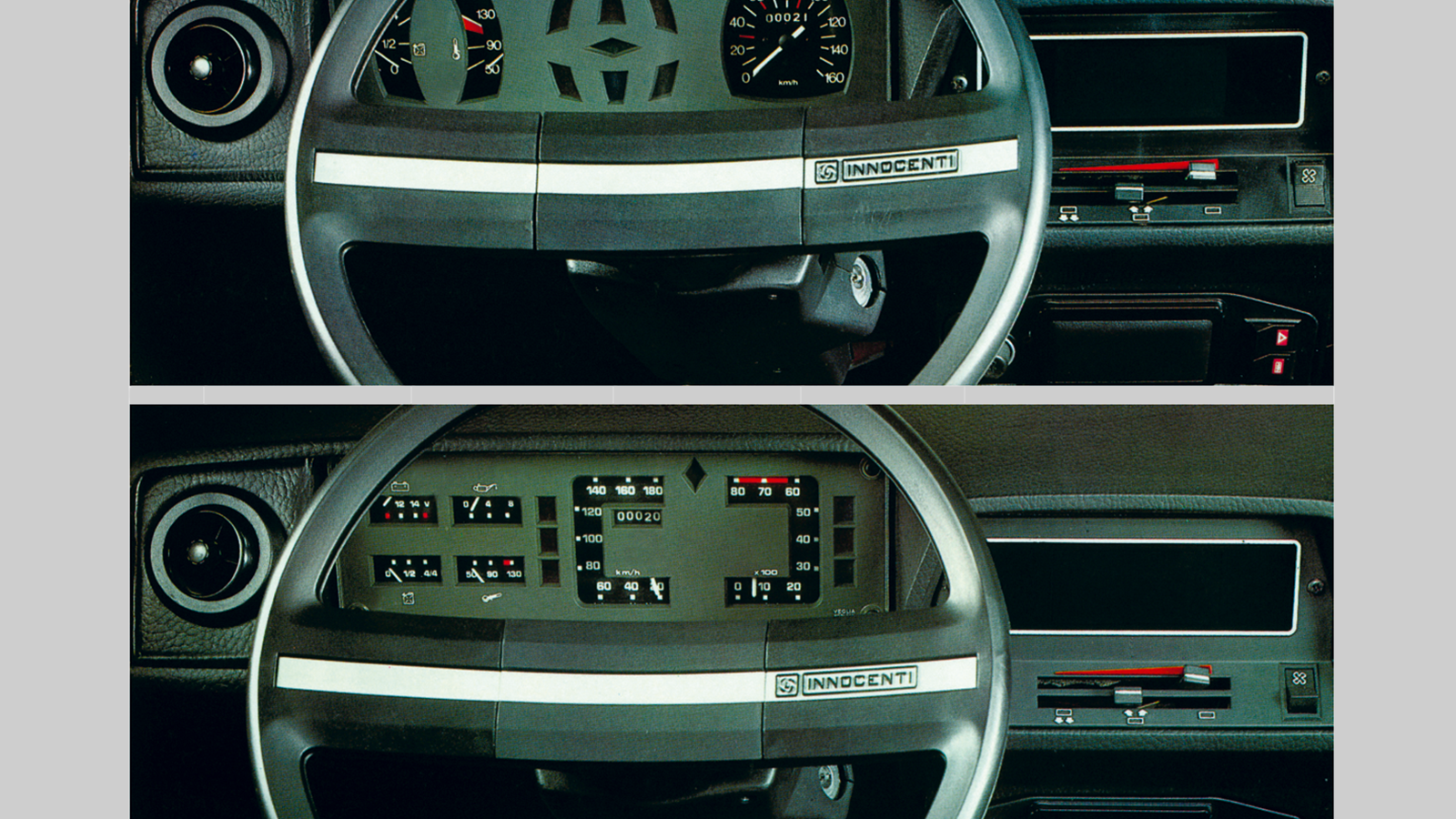
This extended to the rather elegant dash, which came with a variety of instrument clusters, depending on whether you chose the 90 (top) or 120 version. Alec Issigonis apparently hated the car.
2. Citroën GS
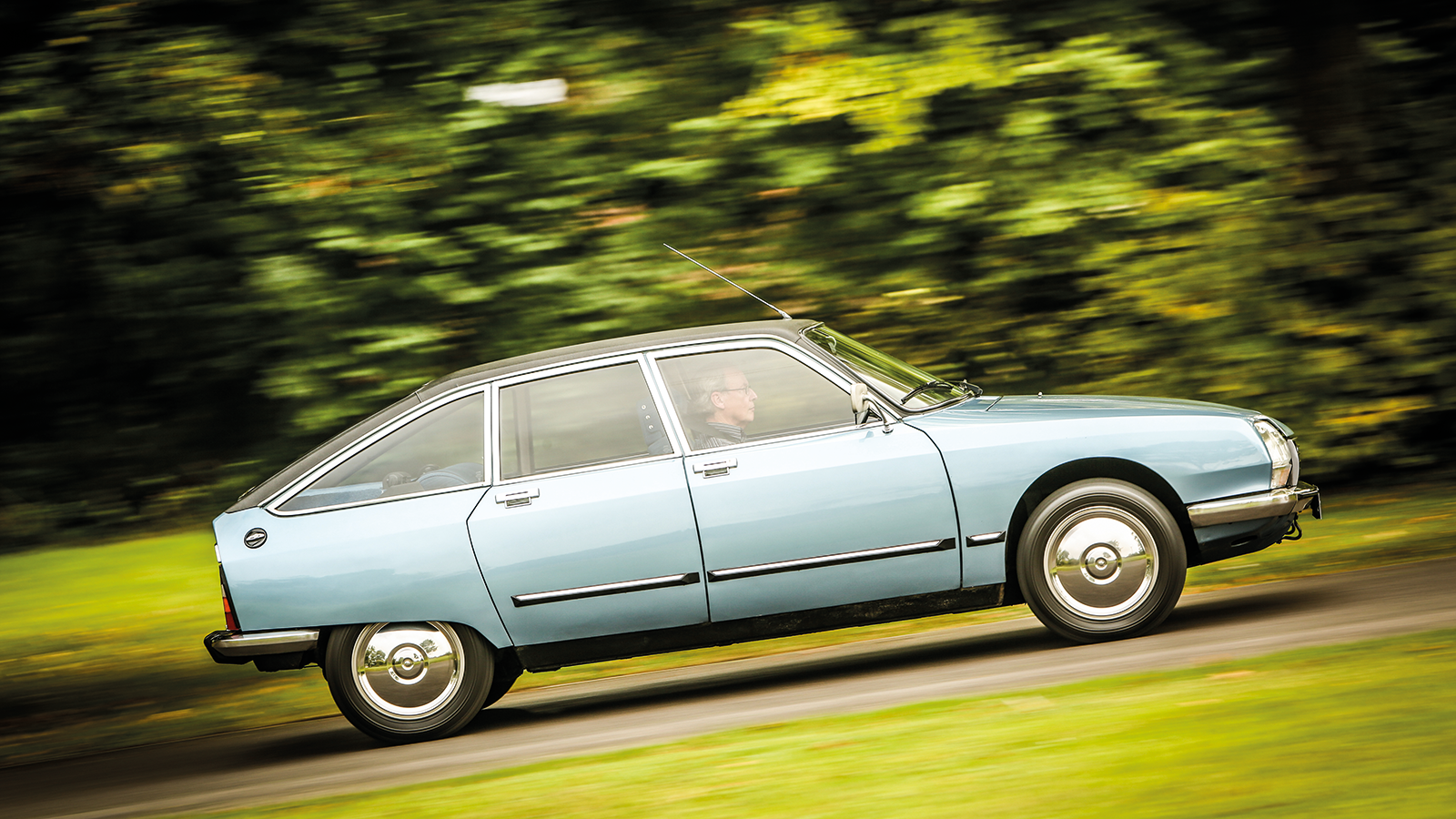
This small family car was a triumph of engineering purity, with its air-cooled, flat-four engine, self-levelling hydraulic suspension and wind-cheating body.
Citroën GS (cont.)
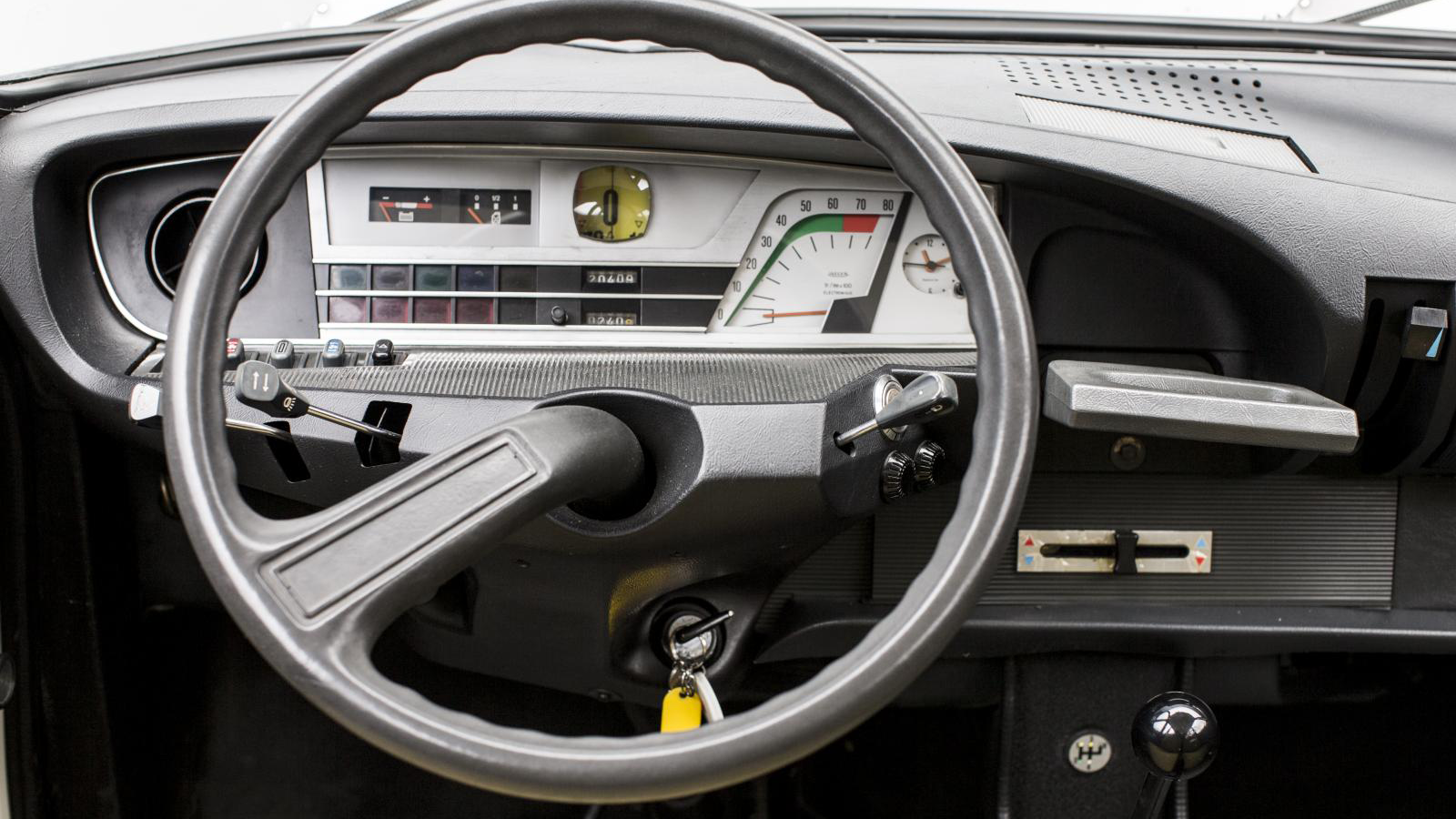
The interior maintained an avant-garde aesthetic, which extended to the instrument cluster, whose graphics resembled a weird piece of medical equipment. The drum speedo’s numbers could be found behind a sort of stylised, monocle magnifier.
Citroën reckoned this was just too peculiar for some markets, so it also created an alternative dash with lots of little round warning lights and dials; this is what UK GS owners saw.
3. Citroën Visa
Citroën’s ability to make clever cars wasn’t matched by its ability to make money, so in 1974 perma-sober Peugeot ate it.
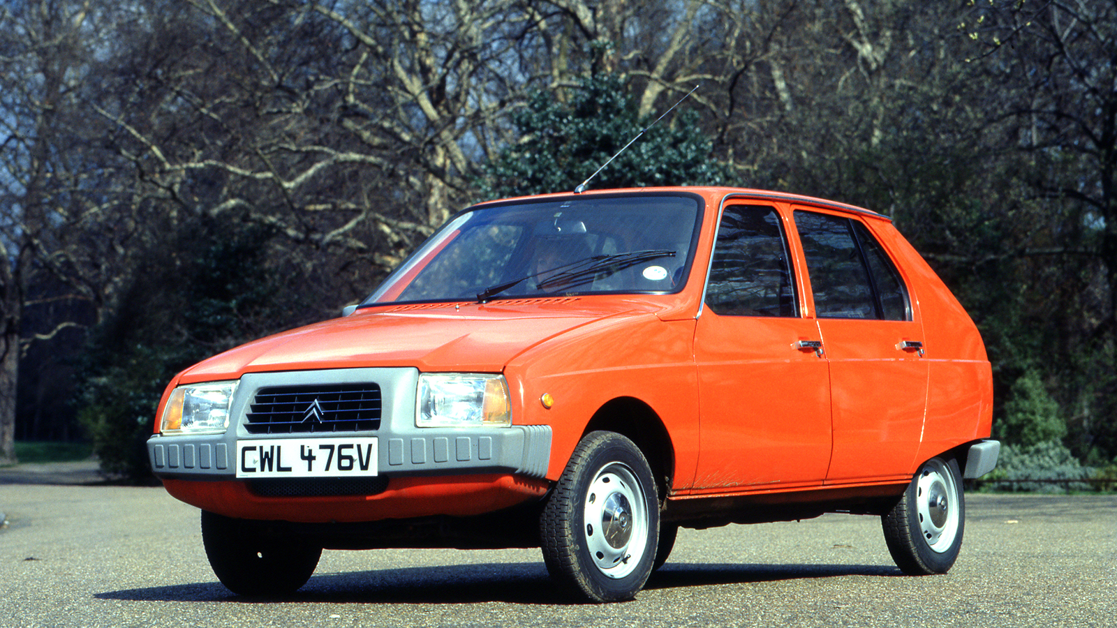
This begat 1978’s Visa supermini, a spindly re-bodying of the Peugeot 104.
The Visa couldn’t quite conform to the norm, hence a 650cc, air-cooled flat-twin version and a delightfully eccentric dash.
Citroën Visa (cont.)
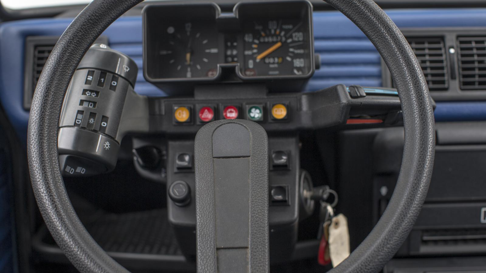
Rather than having column stalks there was a sort of cocktail shaker with buttons and switches for lights, indicators (which didn’t self cancel) and horn.
On the other side were the heater sliders and further buttons were reached by sticking your hand through the single-spoke steering wheel.
With familiarity it actually worked rather well, but the dead hand of convention later saw Citroën junk the Visa’s distinctive dash for an entirely ordinary ergonomic ensemble.
4. Panhard Dyna Z
Panhard was one of the world’s oldest car makers, but after WW2 the big vehicles it made were a hard sell, so it came up with the ingenious Dyna economy car.
Revealed in 1946, this front-drive, 650cc car had a flat-twin, four-stroke air-cooled engine, torsion-bar suspension and an alloy body. It was quirky, clever and efficient.
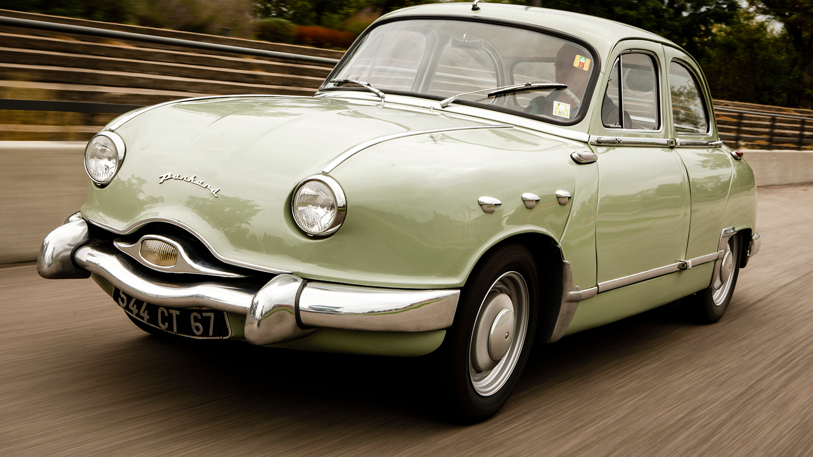
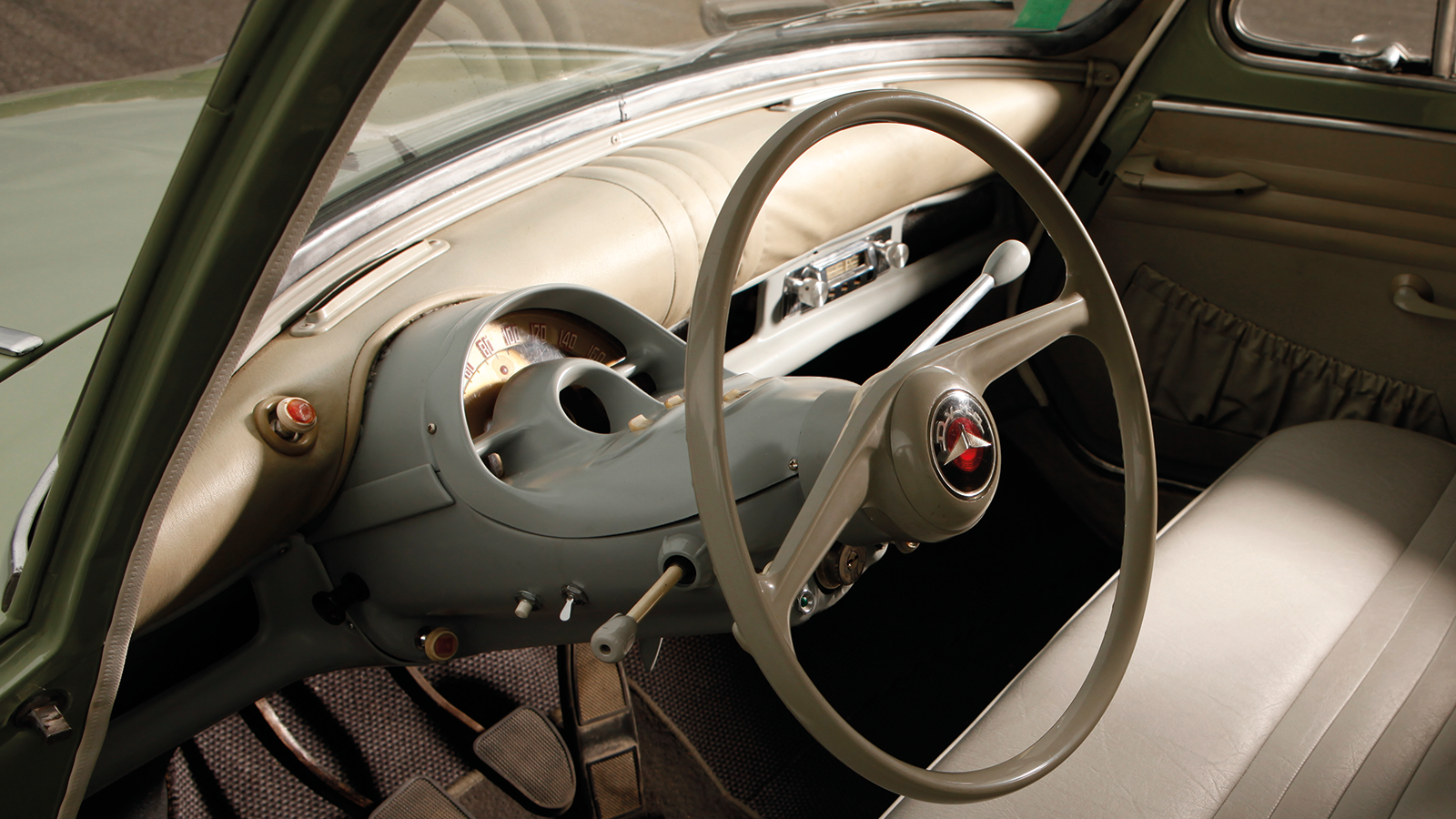
By the 1950s it had morphed into the bigger-in-every-way Dyna Z (pictured), which eventually became steel-bodied but still looked like a started reptile.
Panhard Dyna Z (cont.)
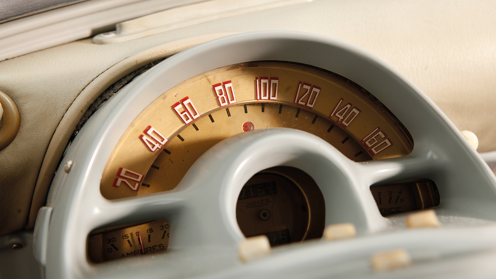
Its driver was confronted by a minimalist, single-piece instrument cluster/steering column shroud.
This looked like the love child of a period food mixer and a fairground ‘What the Butler Saw’ machine – but with a good bit more style than that might suggest.
5. Aston Martin Lagonda
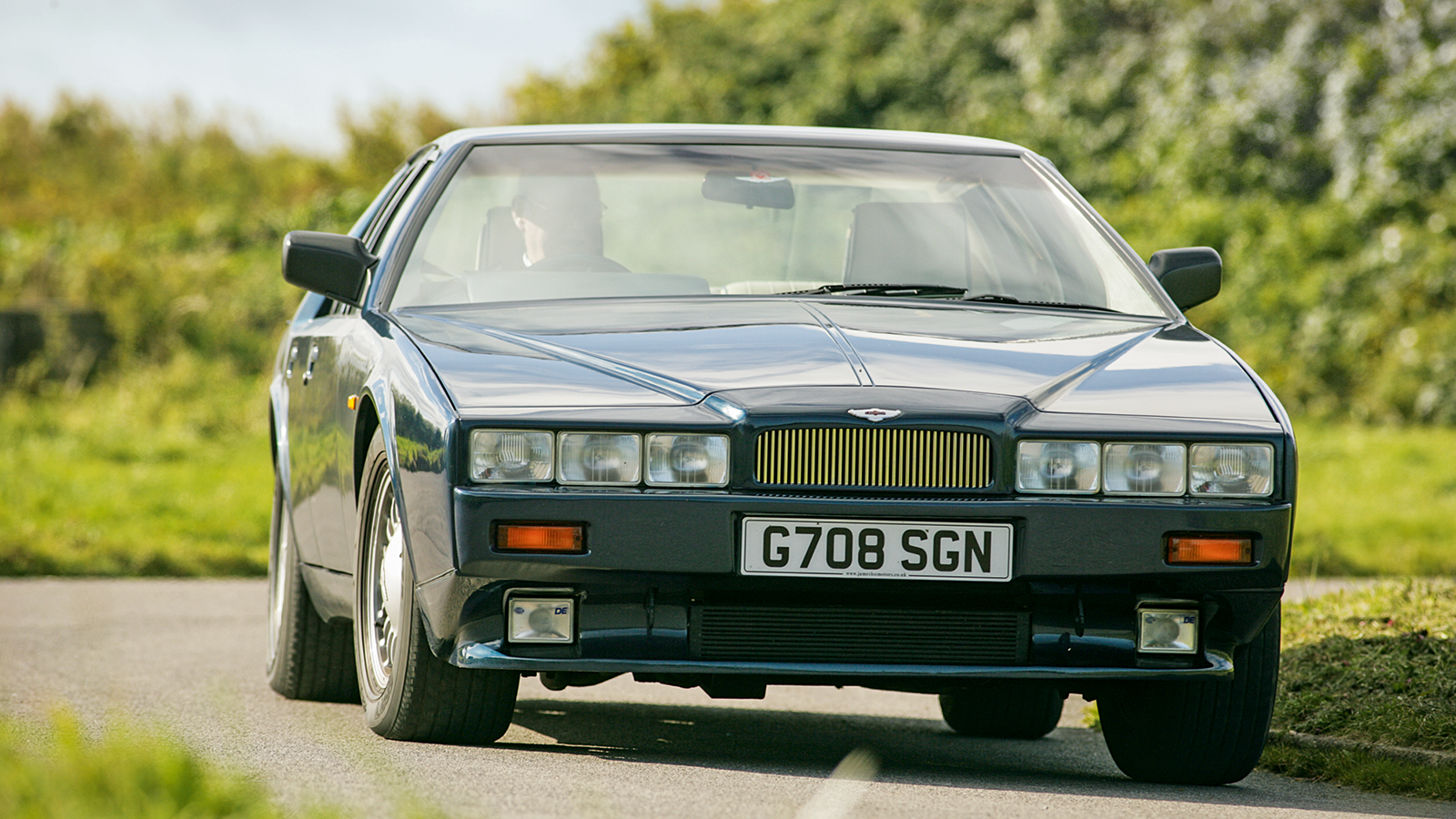
If ever a car demonstrates that nothing fades faster than the future, then it’s surely 1976’s wedge-shaped Aston Martin Lagonda.
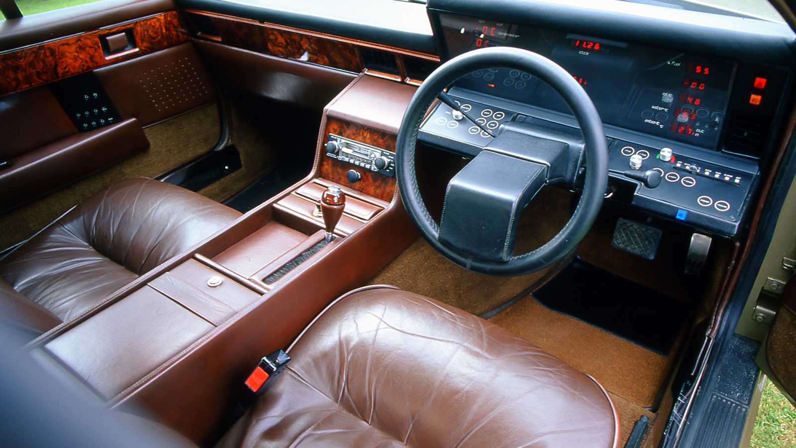
Apparently styled with a set-square by Bill Townes, this long, low V8-engined saloon had a dash that apparently channelled period science fiction series Space 1999.
Aston Martin Lagonda (cont.)
In an entirely analogue world, the car’s solid-state digital instruments were a cause of considerable excitement.
Sadly, the technology that made it work tended to die with monotonous regularity, in the process causing owners considerable irritation.
6. Austin/MG Maestro
The Golf-sized Maestro was one of those 1980s cars that was billed as the saviour of the British industry. It wasn’t.
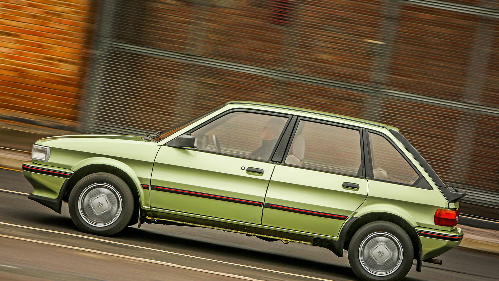
Frumpy outside but spacious within, the Maestro, sold with Austin and MG badges (pictured), replaced the Allegro and Maxi in 1983.
Austin/MG Maestro (cont.)
Austin Rover hoped everyone would be wowed by partial robot assembly, bonded windscreens and, in MG and Vanden Plas versions, tinny electronic voices giving instructions in 15 programmable languages plus a solid-state digital dashboard with Casio watch-style graphics.
Instead, this otherwise decent car soon got a reputation for carburation problems, cracked bumpers and leaky windscreens. That the digital dashes also went on the blink, leaving the Maestros suffering from vehicular laryngitis, was a surprise to nobody.
7. Audi quattro
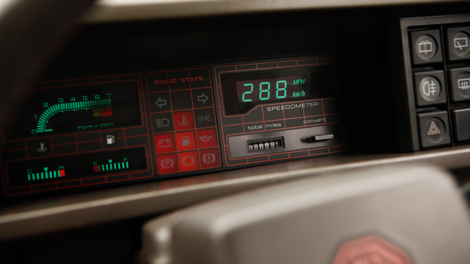
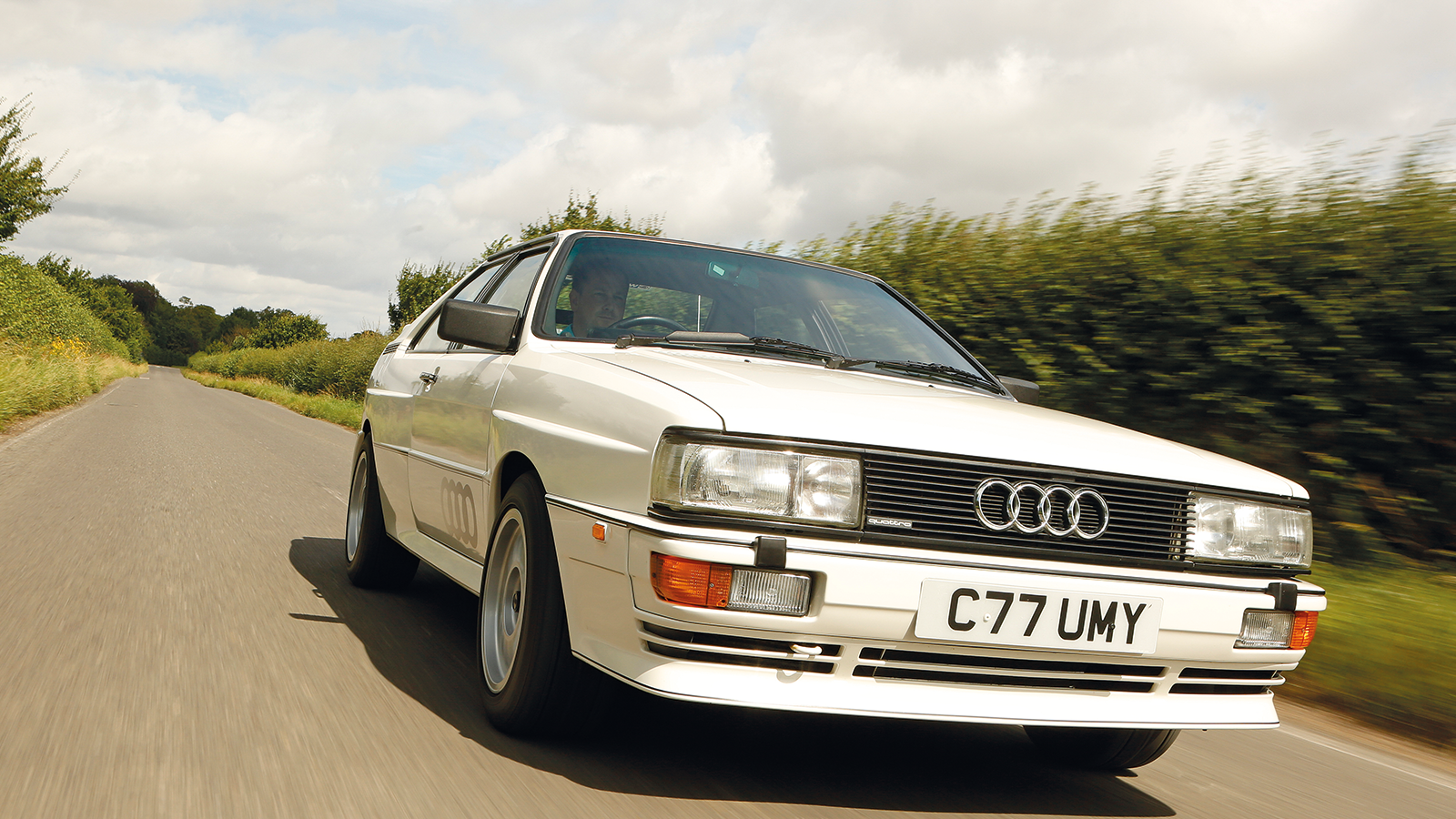
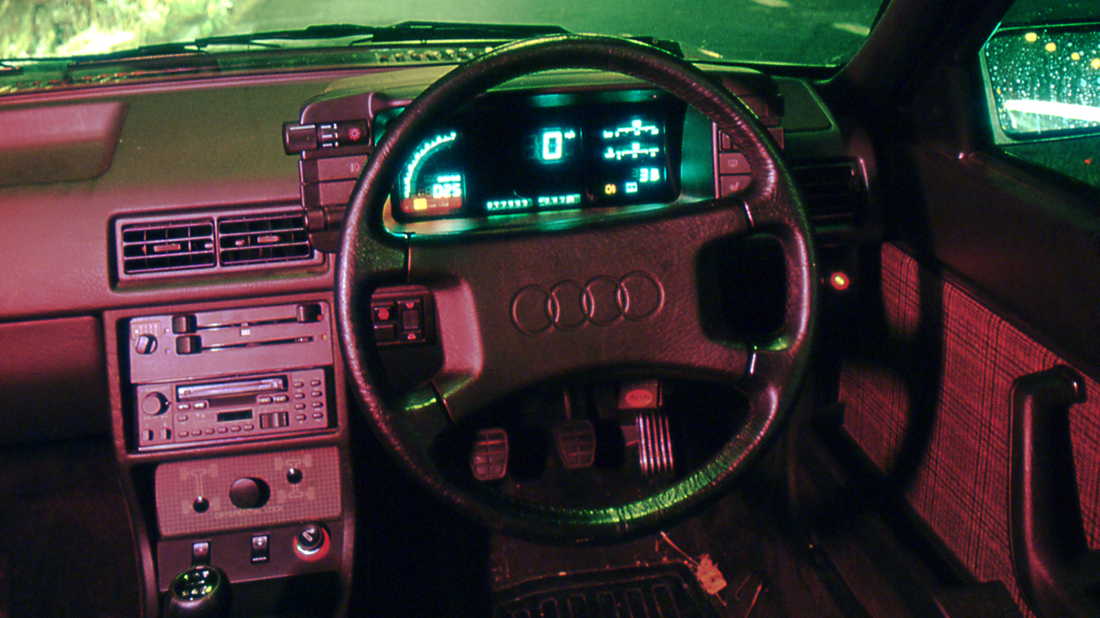
Like the Maestro, Audi’s revolutionary quattro all-wheel-drive coupé was offered with superficially similar digital instruments and voice synthesisers, but there the similarities ended.
Launched in 1980, the turbocharged quattro was a charismatic design and engineering tour de force that soon began winning loads of rallies. And, by the time production stopped in 1991, the car’s reputation as a motoring legend had been cemented.
Audi quattro (cont.)
One of the key differences between the Maestro and quattro, at least as far as the dashboard went, was that the quattro was German – and as a result its vacuum fluorescent readouts (launched in 1984) were generally less inclined to conk out.
8. Chrysler Airflow
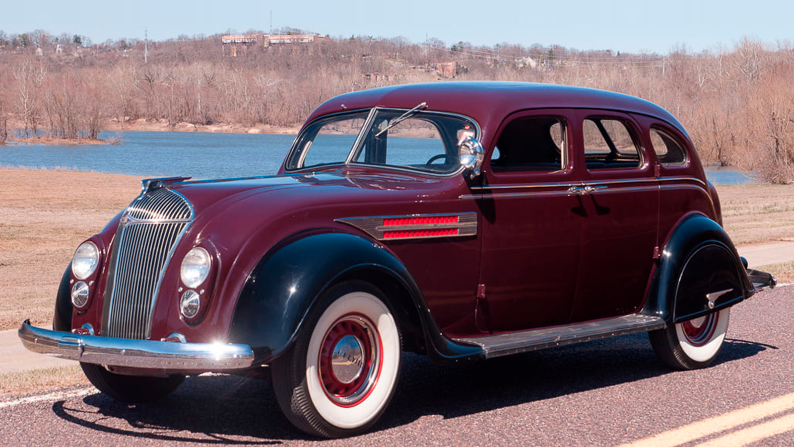
Along with the Citroën Traction Avant and Cord 812, the Chrysler Airflow was perhaps one of the early/mid 20th century’s most innovative cars.
In 1934, just seven years after the Model T ceased production, the Airflow had a body developed in a wind tunnel engineered with the Wright Brothers, safety glass, hydraulic brakes and a unitary body strong enough for Chrysler to make film of one going over a cliff and driving off afterwards.
Chrysler Airflow (cont.)
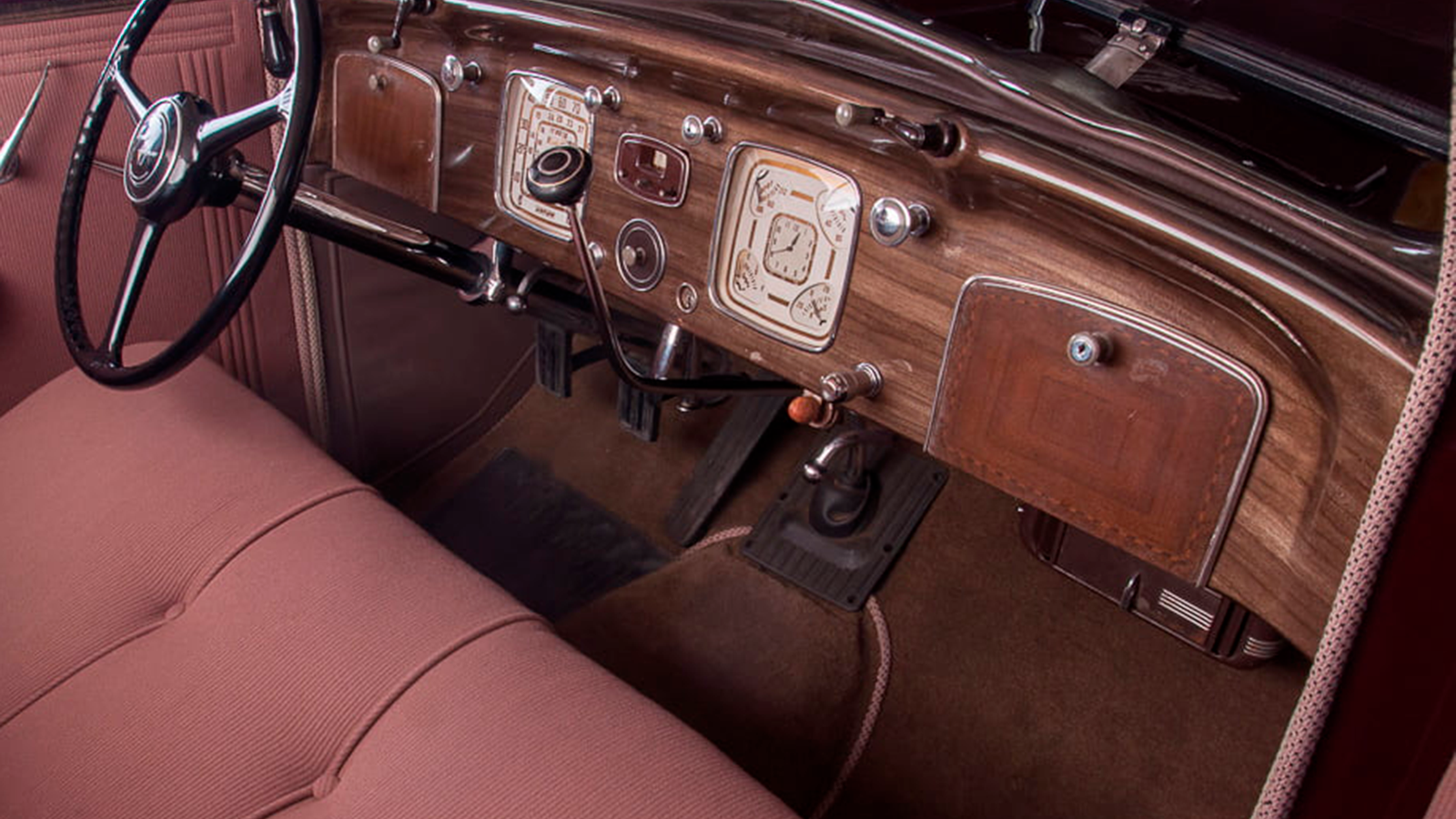
Its six-seat interior is a paean to Art Deco, and the Airflow’s dashboard is a prime example of its elegant design.
All of the instruments were heavily stylised, and one dial managed to incorporate a clock and four of the car’s vital signs, while still being clear to read and attractive to look at.
9. Ford Cortina Mk3-5
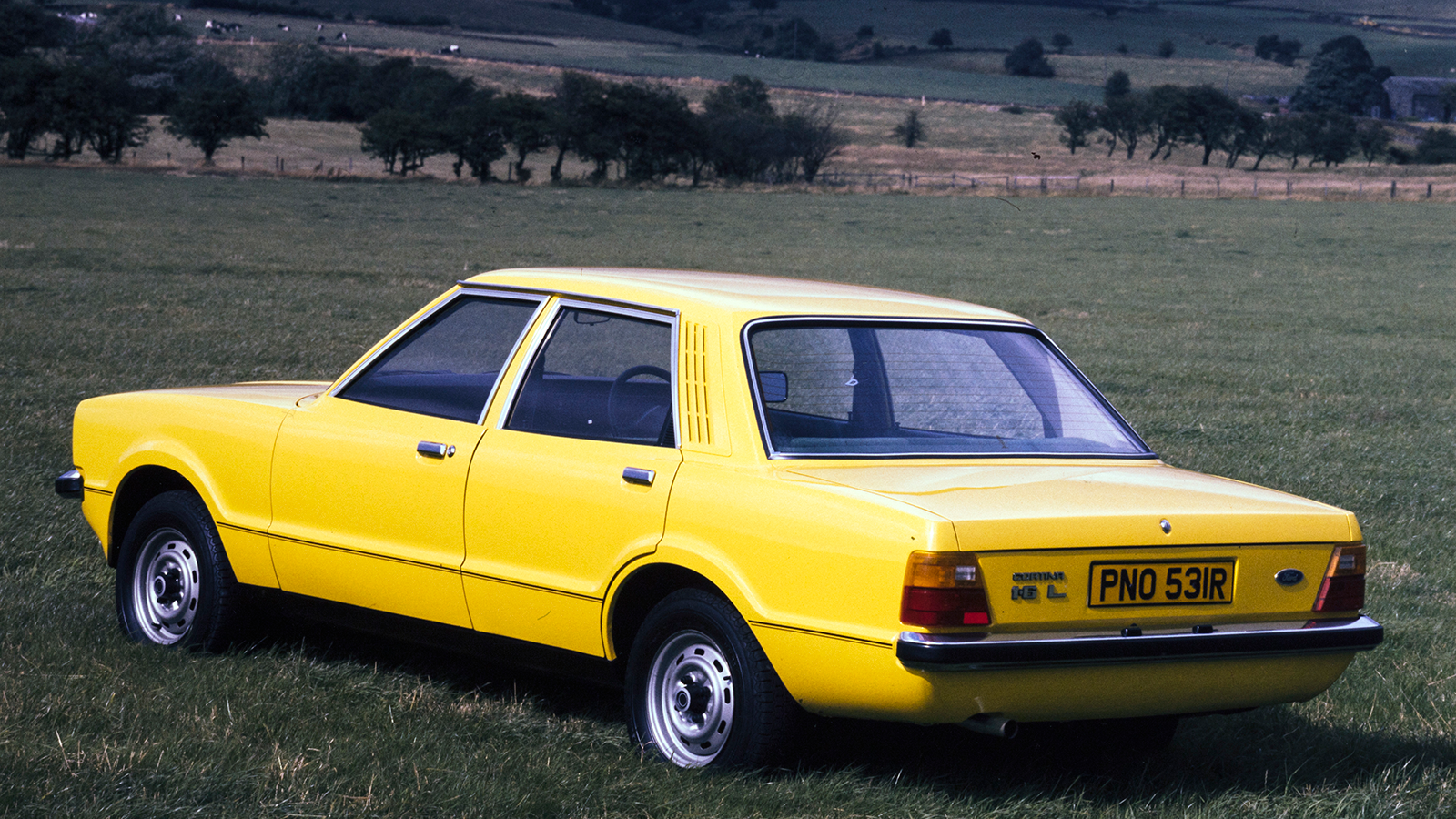
The 1970-launched Mk3 Cortina, with its brashly handsome Coke-bottle styling, has developed a retro cool that period car critics, who rather hated it, would have found baffling.
Not that its poor reception hurt sales – this cheerfully vulgar rep’s chariot spent years as Britain’s best-selling car.
Ford Cortina Mk3-5 (cont.)
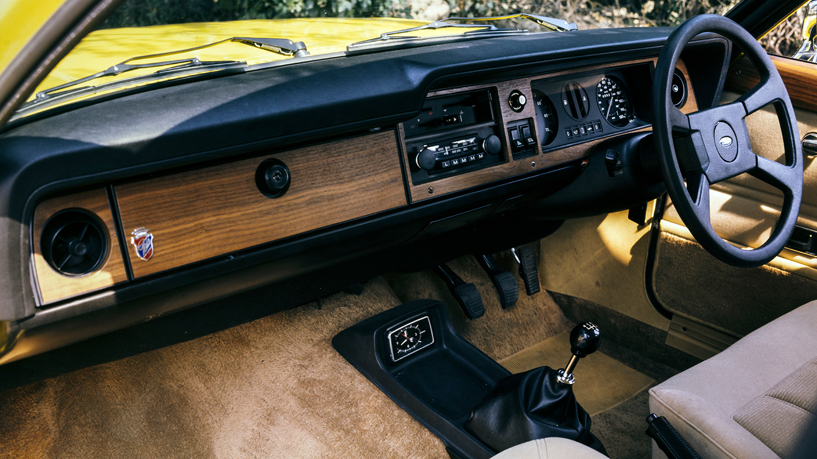
In 1973, Ford facelifted the Cortina, getting rid of its 1960s American-look ‘sweep away’ dashboard and replacing it with a very neat design that featured instruments hidden behind BMW-like glazing.
Fans christened this ensemble ‘the plank’ and it actually won a design award. Ford, keen to hang on to a good thing, barely changed it during the next nine years.
10. Rover P6
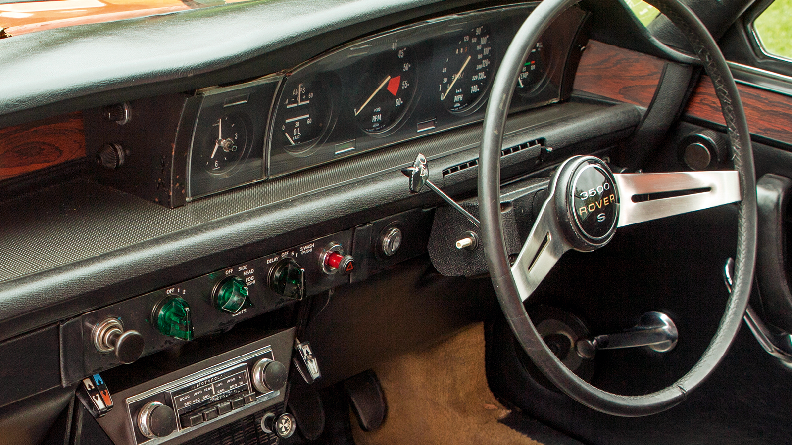
This quietly innovative car is credited by many for creating the executive sports saloon market now dominated by Audi, BMW and Mercedes-Benz.
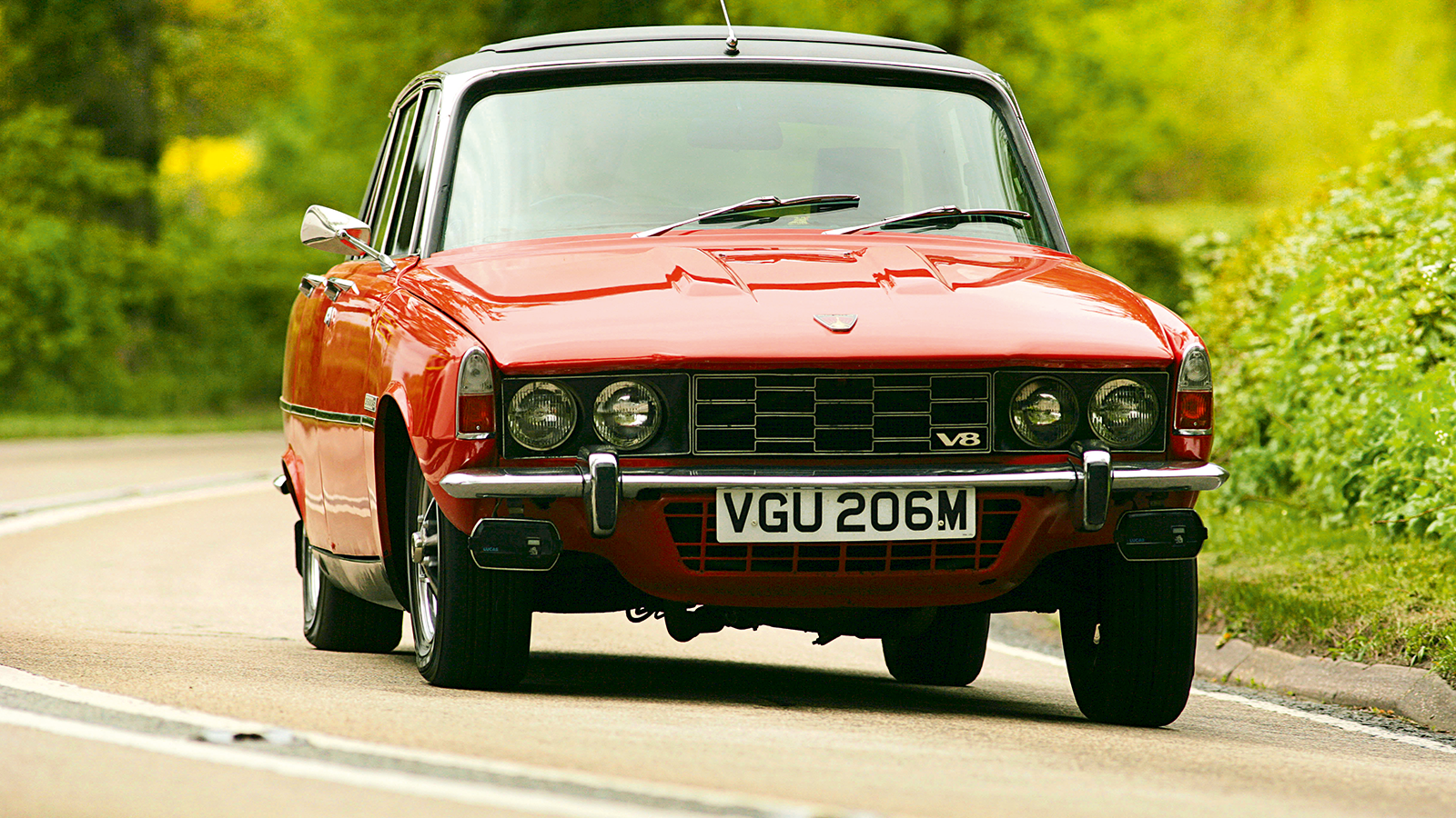
It had Citroën DS-like base unit construction, some alloy panels, four powered disc brakes and ultra-compact double-wishbone front suspension, creating a wide engine bay that Rover hoped would accommodate a jet engine – and which later made it ideal for a V8, as pictured here.
Rover P6 (cont.)
The interior featured medically designed seats and a dashboard designed to prevent injury. It won the Don Safety Trophy and AA Gold Rosette for Safety – oh, and it was also named the first ever European Car of the Year, in 1964.
Later, its period strip-speedo was augmented by a bigger, stylish four-clock display that was the first to use printed circuitry.
Sadly, lousy British Leyland build quality tarnished the P6’s latter years.
11. Mercedes-Benz 280SL ‘Pagoda’
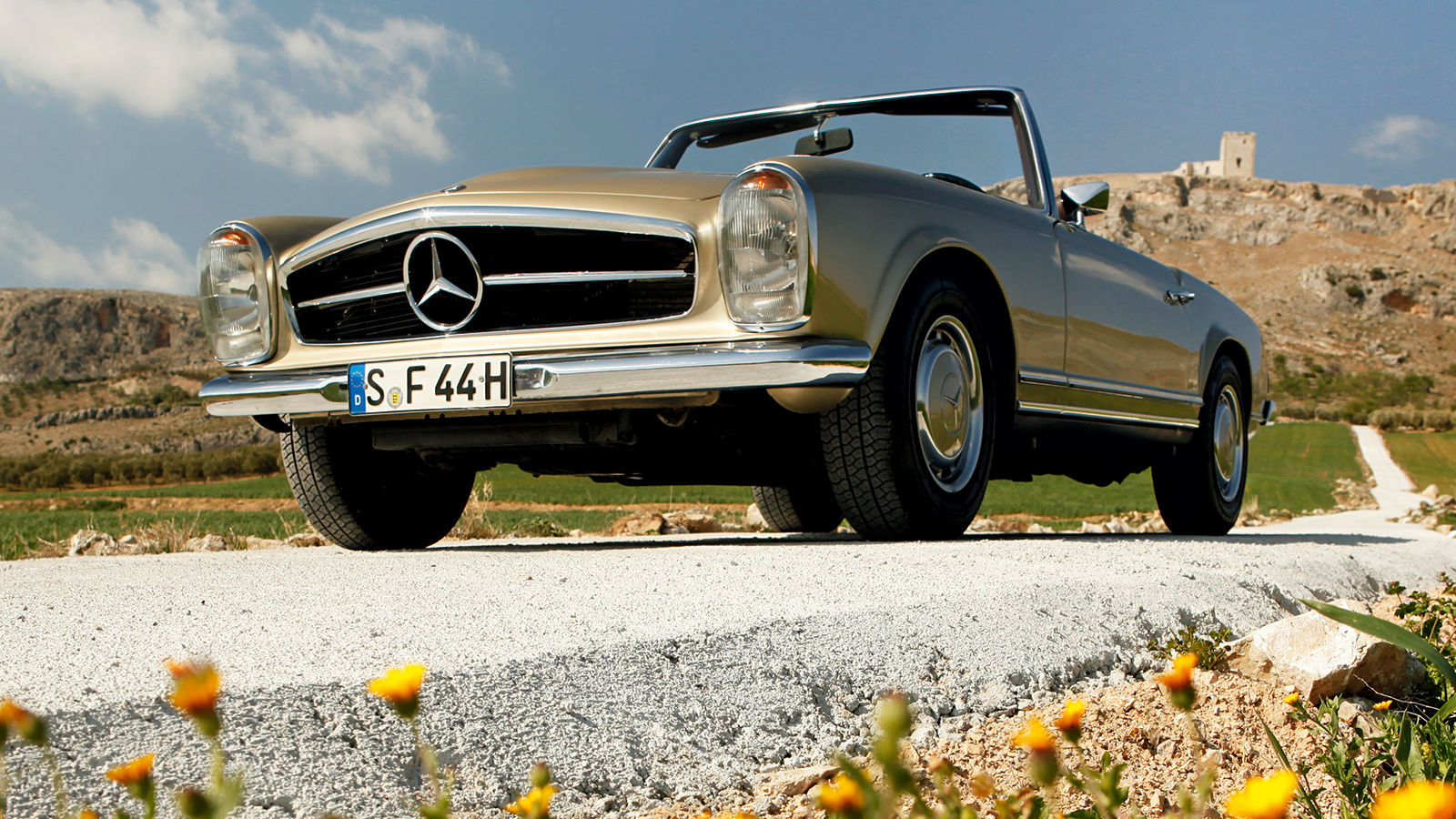
The 1960s was the era when Mercedes’ styling became inimitable.
Much of that was thanks to the guiding hand of celebrated designer Paul Bracq – a man who would go on to work similar wonders at BMW – who ensured that all Mercs shared a family likeness both inside and out.
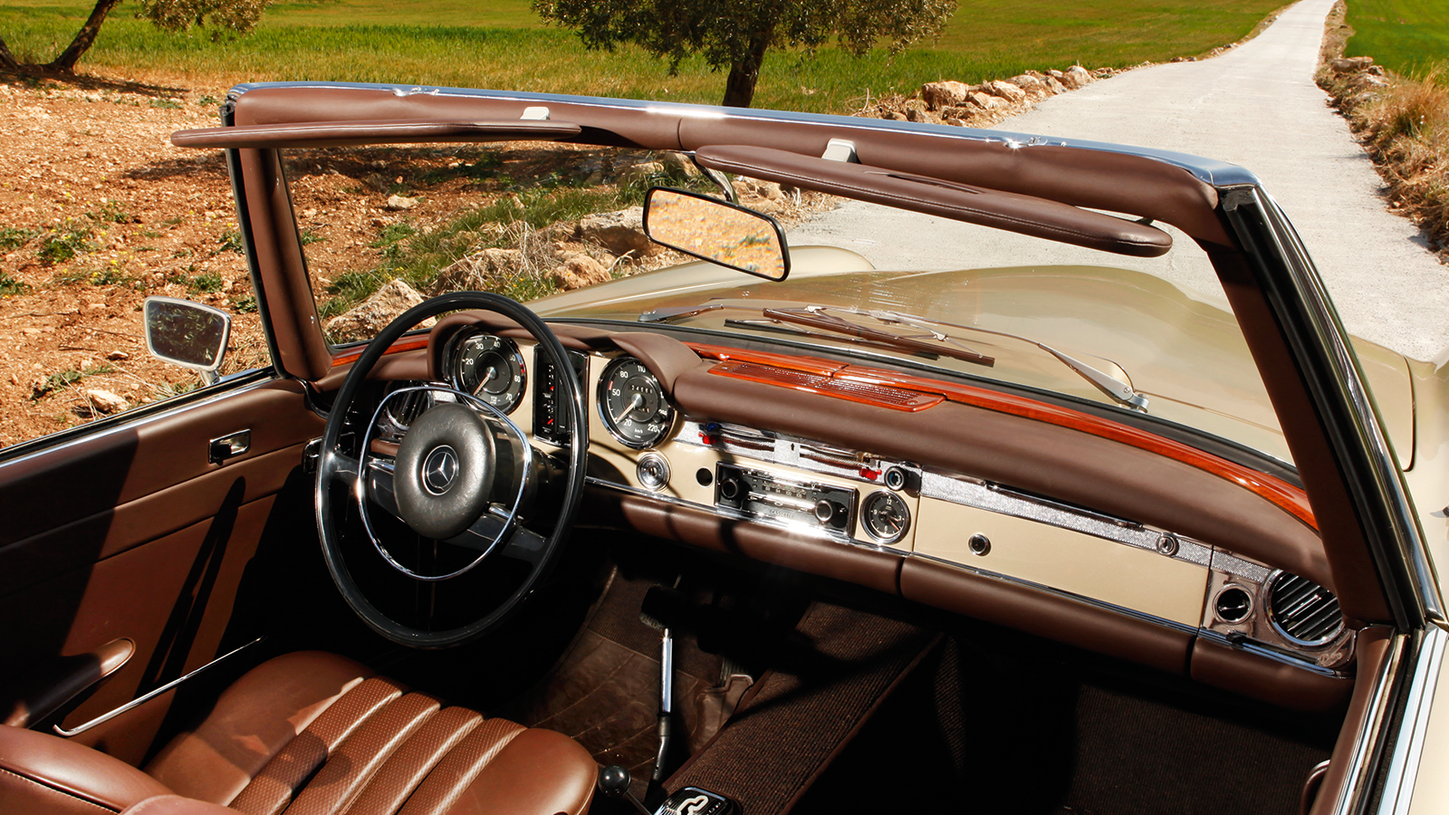
Mercedes-Benz 280SL ‘Pagoda’ (cont.)
One of the styling tropes that appeared under Bracq’s watch were vertical, stacked headlamps, and this visual motif continued inside – which, in the case of the SL’s metal-faced dashboard, meant a vertical cluster of gauges sitting between the speedometer and rev counter.
The rest of the controls had a pronounced ergonomic precision that was also typical of Bracq’s work.
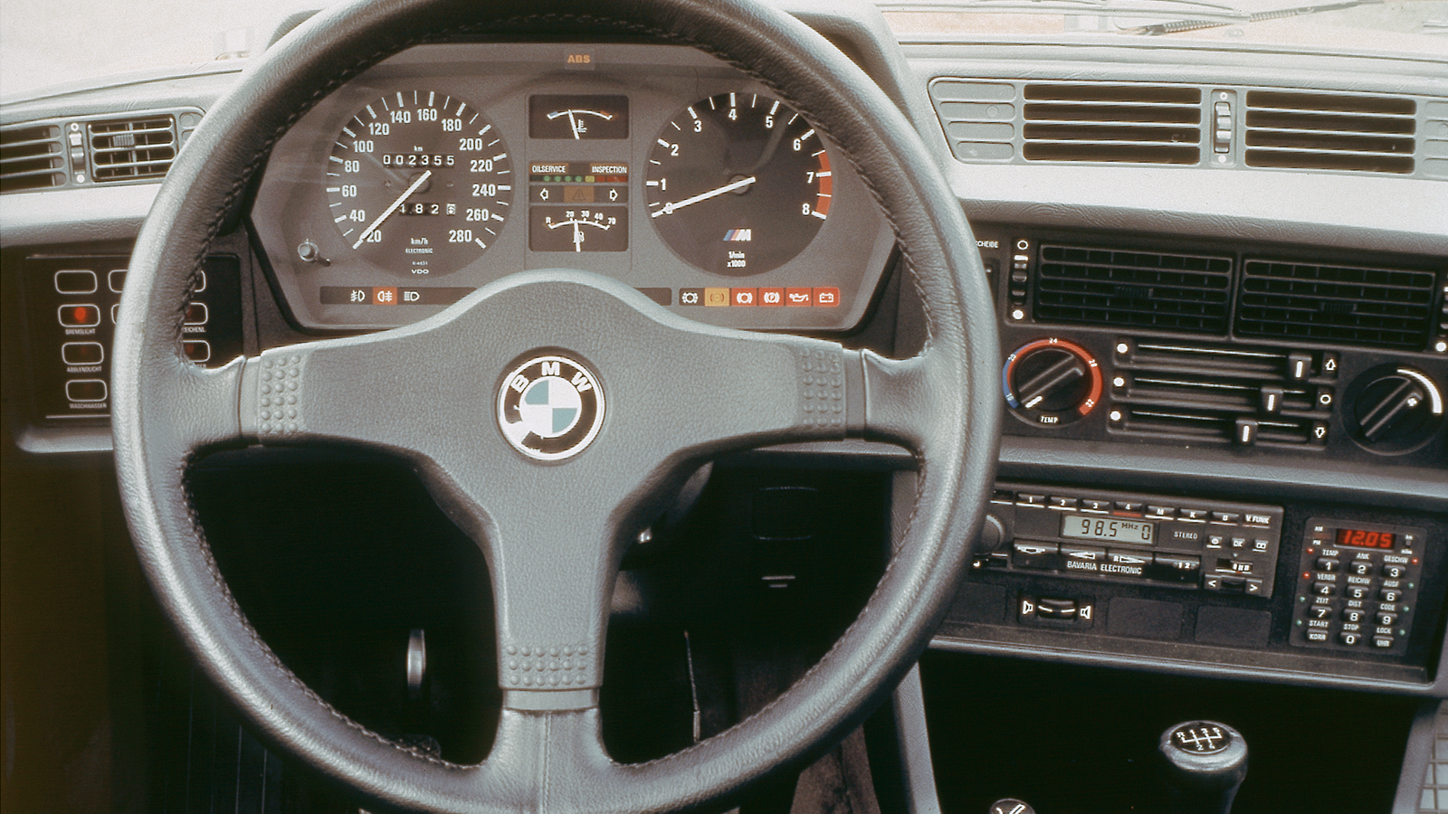
12. BMW E24 6 Series
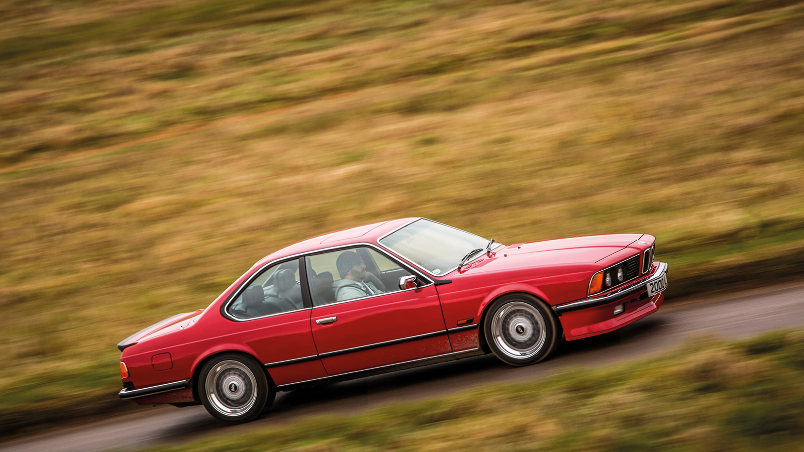
With its shark-nose front-end and sometimes tail-happy backside, BMW’s E24 6 Series coupé became a 1980s Yuppie fixture – although it actually appeared in 1976.
BMW E24 6 Series (cont.)
Its cabin pioneered the techno-bling aesthetic which German car makers have loved ever since – although these days with ambient interior lights, warning lamps and acres of buttons. The 6 Series made do with a check panel of red lights to tell the driver if it felt ill.
With a dash and minor controls angled toward the driver, the ergonomics were superb and even today the dash looks more modern than ones found in cars a decade younger.
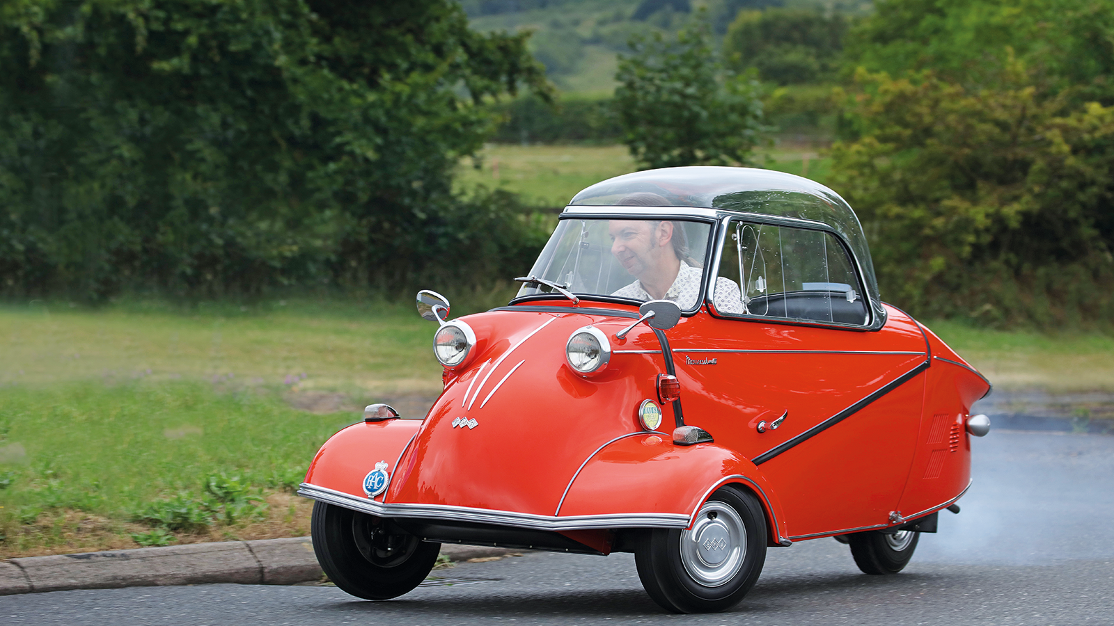
13. Messerschmitt KR200
After WW2, German military aircraft maker Messerschmitt had something of an image problem in Europe and wasn’t allowed to build aircraft.
Instead, it started producing a tandem-seat bubble car with one wheel at the back and two at the front, developed from an invalid carriage designed by engineer Fritz Fend.
The tiny car looked like a wingless light aircraft and was capable of almost 60mph (its four-wheeled TG500 Tigers were quicker still).
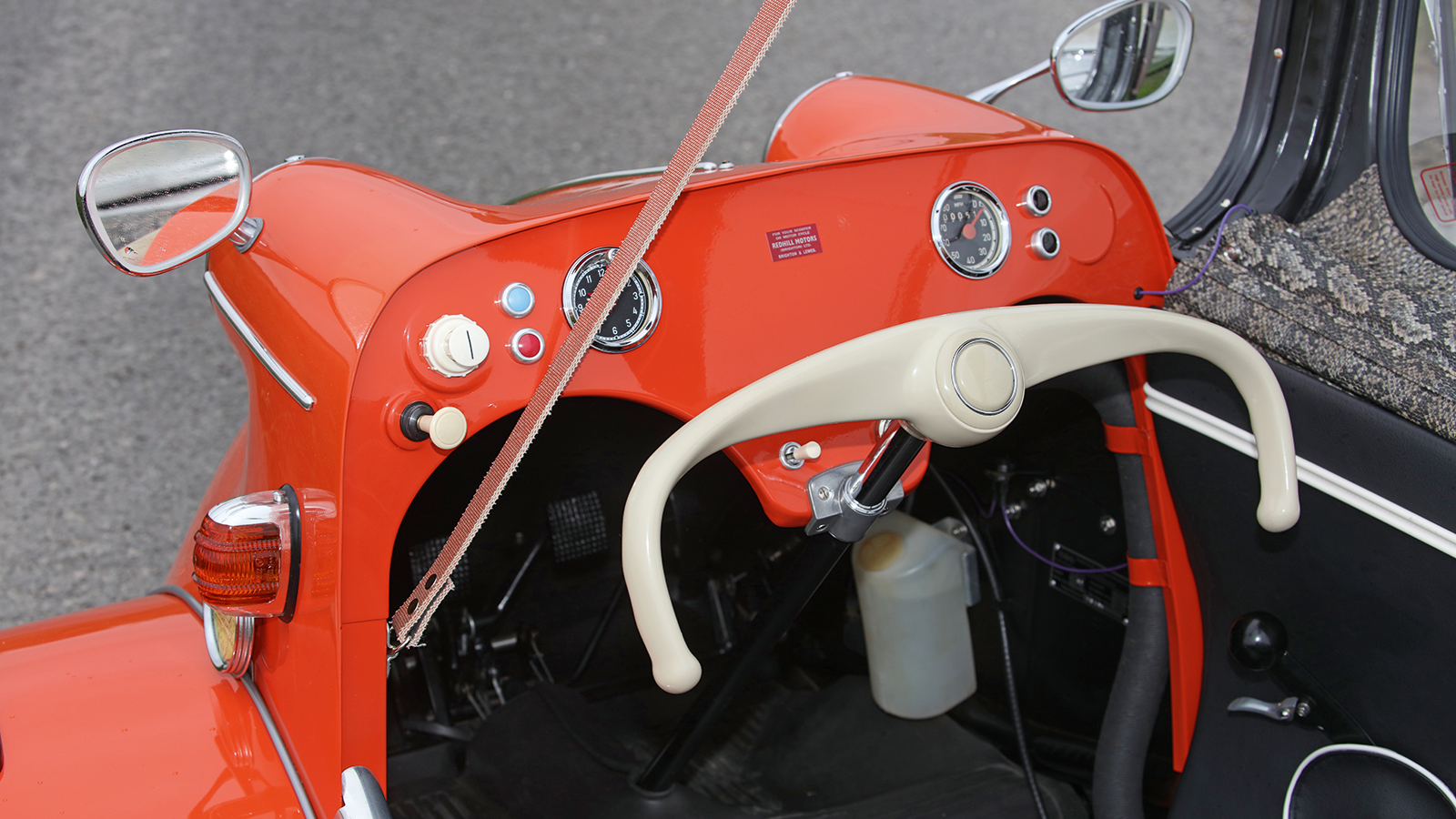
Messerschmitt KR200 (cont.)
The cabin was understandably less than plush, though.
The driver was confronted with a meagre scattering of switches, a couple of dials and a set of handlebars, jutting from a metal dash with two metal cut-outs designed to accommodate his or her knees.
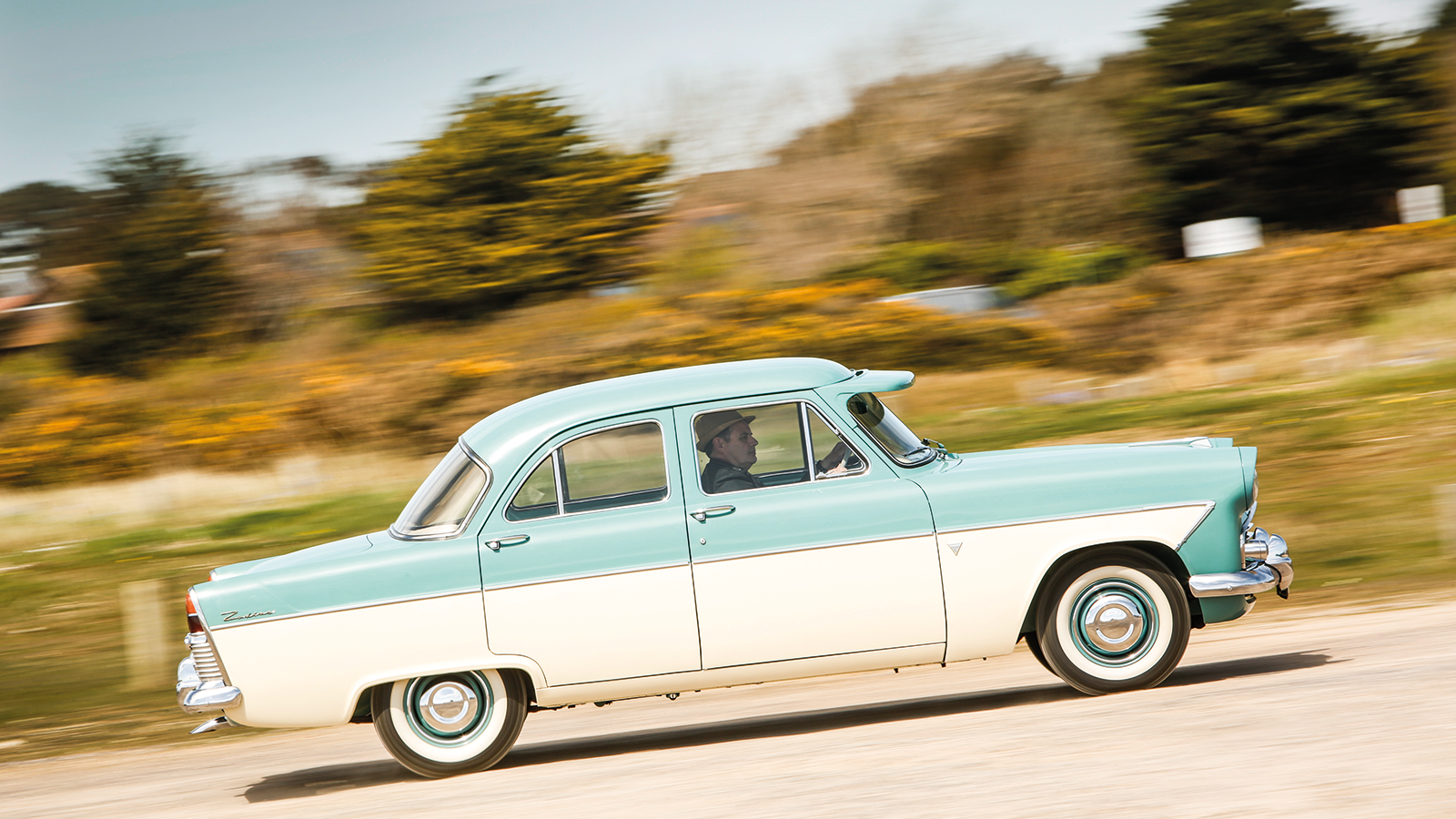
14. Ford Consul/Zephyr/Zodiac Mk2
With its slab sides and full-width bodywork, the original Ford Consul/Zephyr of 1951 caused quite a stir in austerity-wracked Britain.
However, its looks were still reasonably toned down – and that could hardly be said of its 1956-launched replacements.
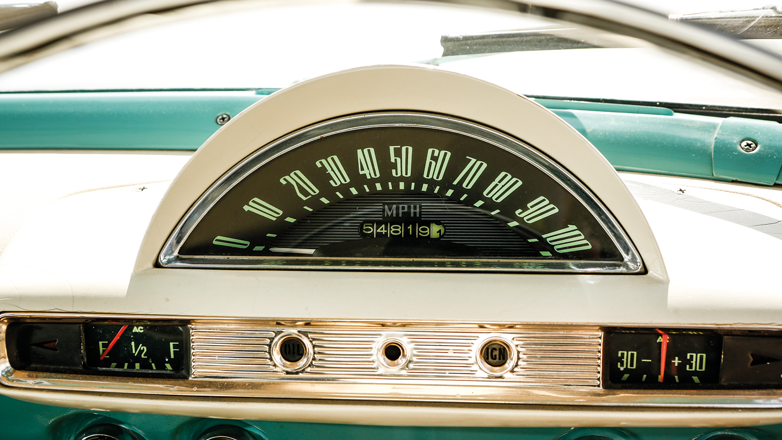
With their wraparound screens and chrome-bedecked bodywork, later cars such as the luxury Zodiac variant as pictured paid obvious homage to American tastes, albeit in scaled-down form.
Ford Consul/Zephyr/Zodiac Mk2 (cont.)
The interiors were just as brash, with brightly coloured trim, bench seats, shiny metal dashboards, crescent and strip speedos, crash-unfriendly knobs and switches, umbrella handbrakes and column gear changes.
Overall, they had the cheerfully vulgar vibe of a transport cafe’s jukebox – and were all the better for it.
